Tuesday, October 16, 2012

Ceramic Cow Container - 8(L) x 5(W) x 6(H)

This is a ceramic double pinch pot container that I made while in college.  Since I just completed moving and have been unpacking my stuff, I ran across my old sketch book for my ceramics class.  I had just unpacked a lot of my ceramics stuff and the cow was fresh in my mind when I started looking through the sketch book.

The project simply was to create a container using two pinch pots.  There was no other direction and the project was open ended as per subject matter.  Many of the other students mentioned during the critique that they believed that the project was either a piece that was a commentary on animal cruelty or that it was a social statement about the direction of our eating habits.  Neither were actually true, but it was interesting to here how others perceived the piece.

Tuesday, August 14, 2012

Medium:  Red Ball Point Pen on White Paper    Size: 4x6

This "Peg Legged Pooch" is a random doodle I made the other day.  He might make an interesting animated figure for me.  Though, in order to animate him, I may have to rework his head a little bit.

Getting ready to move in the next 2-3 weeks so this is probably my last post until mid-late September.

Tuesday, July 31, 2012

Falling a little behind lately as it's been the month of traveling around interviewing and not having enough time to make any art. This coming month is going to be just as crazy as I'm starting to pack since I'm moving. I should have something soon though...I'm taking another painting class and will finish up in a week or two.

Here's an older piece though....
Medium: Oil Paints on Masonite       Size: 24 x 36

This picture is one of my first oil landscape paintings that I did in my first oil painting class.  There is a lot of artistic license taken on this image.  The original painting, which was mostly wiped away had the hill on the left going the entire way across the picture. 

The original concept drawings were done at Clearcreek State Park near Siegel, PA.  This park is down between two mountains and the river winds between them, but my teacher felt the the image was boring and wanted me to open it up and change my painting to include more sky and distant hills and mountains. 

Friday, July 6, 2012

Medium:  Acrylic Paint on Mixed Media Paper    Size: 24x36
Title:  "Rose Petal"

This piece is titled "Rose Petal" simply because that's what the image is.  I took a abstract painting class where we got to use an electron microscope to magnify objects thousands of times.  This painting also had to be done monochromatic, so I chose to use Pthalo Green.

The electron microscope only identifies in black and white and the rose petal had a value change from light to dark and had very small cracks(?) in it that were unvisible to the unaided eye.  It was a very interesting class to take and some of the images from objects that people brought in really yielded some amazing views.

Wednesday, July 4, 2012

Medium:  Acrylic Screen Print on Canvas    Size: 8x10

I've gotten really re-interested in printmaking lately and this cupcake piece is the first try and getting back into screenprinting.  I have not screenprinted in a number of years and the red outline really shows that.  I do believe that part of my issue was the lack of additional coats of gesso to fill in some of the dips on the canvas.  Both the yellow and blue parts were painted on after the red outline had time to dry.

I was very excited to do this again and can't wait to get a little more into it.  I have many ideas that I'd love to do and will hopefully be able to show them in a couple weeks...when I'm not painting, drawing or working on my etching of the bridge in the previous post.

Monday, July 2, 2012

Medium:  2H Pencil on Sketch Book Paper   Size:  2x3

This is a small sketch I did the other day in Homestead, which is just outside of Pittsburgh and crosses over the Monongahela River.  Though I was sure at the time that it was no longer in use, I was proven wrong while sketching in that area when a train with large loads of coal crossed over it.

I plan on using this sketch to create an etching and practice up on printmaking skills that I have not used in some time.

Wednesday, June 27, 2012

Medium: Oil Paints   Size: 8x10

This was my very first painting during my first oil painting class at the Carnegie Museum of Art.  It's a green monochromatic still life.  Monochromatic is the use of a single color with the addition of white and/or black.  In this instance, I did not use any black, the darkest of the colors is the just the pure, out of the tube color.  I believe that the color I used was Viridian Green.

This class was an introduction to painting class and many of the other students had never painted before.....so what did the teacher do?  She put up a striped ceramic cup, a striped background and an old-styled metalic, reflective tea-pot/pitcher.  I can definitely say that many of us struggled with the stripes.  What a pain, I used that striped container in another painting and decided after that that I would never include a striped subject matter ever again.

Tuesday, June 26, 2012

Medium: Graphite on Sketch Book Paper          Size:6x7

This is another house done on Pittsburghs South Side on 28th Street.  It's a tall 3 story house with aging brick.  It sits besides a pottery studio/shop and I was sitting around waiting to meet someone and had the time so I decided to make a quick sketch of the house.

It's probably one of the very few houses that actually has off street parking in this particular neighborhood.  There are a few other houses, but not many, it has a steeple like piece to the front corner and a couple of the windows have stained glass designs in them.  Perhaps this coming week, I'll try to draw the front of the house, I just found the verticals, horizontals and diagonals of this view to be rather interesting so I cut off the rest of the house.

Tuesday, June 19, 2012


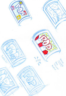
Medium: Blue Col-Erase Pencil / Colored Pencil    Size: 8.5x11 white paper (x2)

This is a screen printing project that I've started working on dealing with Pop Art and since I'm from Pittsburgh...it's Pop....not Soda.  Haha.  Though Andy Warhol is the big Pop Art name in Pittsburgh and I draw a lot of inspiration from some of his works, these pieces are actually inspired by another contemporary local Pop artist named Burton Morris. 

Like most Pop artists, he takes popular everyday items and turns them into art.  His art though is fairly cartoony and is usually built three dimensionally so that it actually POPs out at you.

These two pages show how I work when developing a piece of art.  I came up with the drawing for the (soda) pop can and then I constantly rework it over and over and over, or until I come with a final design that I really like.  This type of process can take quite a while to finish since I'm still altering the design even after I think I'm happy with it.  I just want to make sure that I'm leaving no stones unturned.

Wednesday, June 13, 2012

Medium: Acrylic Paint, White Gesso on Kraft Paper   Size: 4ft x 5ft

This is an abstract piece that I did during an painting workshop.  The concept was to just try things that we had not done before.  It took me a couple minutes to try and figure out what I was going to do and was struggling when I decided to just dip my hand in the gesso.  As the gesso dried on the paper, I used tubes of paint to color in the negative spaces left between the handprints.  I held the tubes of acrylic paint as if they were a writing utensil and lightly squeezed as I drew and colored in the areas.  (That action was inspired by some of the artwork that Jackson Pollock created that pre-drip painting.)

Only one handprint is completely outlined and I'm still not sure that I'm happy with doing that, but I also think it was the starting point for color on this piece.

Sunday, June 10, 2012

Medium:  2B Pencil on Strathmore 60lb Paper      Size:  6.25 x 8.5

This is a farmery-type character that I developed one day at Jeannette High School while on my prep period.  I was finishing up when the next class came and they seemed awe struck at the shading...which I thought was the most insignificant part =/

I really liked his overall movement and I don't normally shade my characters, but since I had the time I just went with it.  I think I had forgotten over time how bad a 2B pencil can smudge.  I'm very careful with my art, but when the students asked to see it, I guess I didn't consider that they would not handle it like me.  Thats what they make erasers for though =D.

This piece has 5 layers of sprayable fixative and still lightly smudges.  Sheesh.

Saturday, June 9, 2012

Medium:  Oil on board            Size: 9x12

This painting is the view from my parents front yard.  They live in a rural area outside of Greensburg, PA and have fields that farmers use on almost every side of their house.  It's usually a very quiet area and good for painting though I sometimes find the amount of trees and fields to be very overwhelming in my paintings.

The only issue I have of painting this area is that there is very little large trees around their house that create good contrast from shadows and usually the sun light is everywhere.

Thursday, June 7, 2012

Medium:  Col-Erase Pencil    Size: 5x6

This was an image made from the corner of Sarah St and 24th St in Pittsburgh, PA.  I was waiting for my fiance to come out from her pottery class/workshop and had about 15-20 minutes to wait.  I pulled out my sketch book and drew the empty corner lot and the 2 building next to it.  I also like the way the pole with the power lines broke up my view and decided to include it as well.

I've been drawn to urban landscapes over the past couple years and I'm constantly searching for new artists who use towns and cities as their subject matter.  I think Ed Hopper and John Sloan were probably the first two artists that really made me appreciate the way that light and shadow can be depicted across a structural surface.  Other favorites include Christopher Greco, Ron Donoughe and Ray DeFazio (the last 2 being artists local to the Pittsburgh area.)

I'm also sometimes leary of drawing these types of landscapes because of all the verticals, horizontals and diagonals.  After years of going to school for animation and working a couple years in that field as a freelancer, I now find that the Col-Erase pencils easily takes away all my worries when working.  I used these eraseable color pencils all through animation school and I now find myself using them whenever working with subject matter that I'm uncomfortable with, but they really do let me drop my inhibitions and just go for it.

Monday, June 4, 2012

Medium: Sharpie Marker       Size: 8.5 x 11

A random cartoon drawn while students were engrossed in a video during one of the classes I subbed for.  He was originally just going to be a guy, but once I threw the body onto the head, the background just came rather quickly.

I suppose he's a caretaker of that poor old cemetary, and I think the only thing missing would be a black cat.

Medium:  Sharpie Marker    Size:8.5 x 11

Another random cartoon of a guy.  It also includes notes of things that two students wanted me to draw for them.  "Something Amazing" - always one of the most difficult requests to fill and "Donald" as is Duck.

Medium:  Graphite      Size: 9x12

This is my new still life I've drawn.  It's an orange juice bottle and a small slightly warped bottle of contact lens fluid container.  I just felt like drawing one day and wanted to do something that I had not done in a while that was not cartoony in nature.


Tuesday, May 29, 2012


Medium: Collage               Size: 4x6 (each)

Recently viewed a Henri Matisse collage at the Carnegie Museum of Art.  The piece titled The Thousand and One Nights" and is on display until July 15th, 2012.  Its a very large piece and inspired me to start making small collage pieces.

The two pieces here, both untitled were created with the thought of the Matisse project.  His piece worked with a lot of hearts so I included those in these two pieces as well.  According to the information card supplied by the museum, the Matisse artwork also shows the passage of time from day to night (white lamp on left (day) to black lamp towards right (night)).  I added a sun and moon to one of the pieces to show the time change as well, but I think mines a little more obvious.  The piece on the right is showing the ebb and flow of love and the ups and downs found in relationships, but for every down there is an up.

Saturday, May 19, 2012


Medium: Oil Paints     "Twin Lakes Upper Lake" - 4x6

This was one of the first paintings that I created post-school.  I discovered a local painter, Ron Donoughe, who paints plein air.  I went to a local park with a small easel and came away with this piece.

It was the first piece I had make that I was happy with.  Most of the previous attempts at painting plein air were not very successful, but I still find it quite fun. I continue working a lot out near my parents house in the country, but want to switch to more urban areas.

Medium:Oil Paints    Sunflowers - 12x16

I did this piece a couple months back during an oil painting class at the Carnegie Museum of Art.  They subject was a group of long stemmed sunflowers in a large glass vase.  I decided to focus more on the flowers and the angles that they hung out of the vase.

The background was painting with a black gesso prior to the painting of the actual flowers.

Friday, April 27, 2012

Wow, it's been so long since I last posted. Been busy with work, substitute teaching, job hunting and life. Anyhow, here's a piece that I did about 2 weeks ago. I've been wanting to learn how to watercolor better and I've been trying to get a class, but so far haven't had any luck...they always get cancelled. So I suppose I'll just start to teach myself.

This image is titled "From the back door" and is a 4x6 watercolor painting on 140 lb. paper.

The trees in the background certinaly seem to need some help and I have to make sure I put down the lightest colors first...definitely more to learn.