Wednesday, May 24, 2017

Getting ready for some printing


I have some time tomorrow to do some more printing and I've got my ink and desktop both ready to hit the ground running when I wake up.

I've carved both of the mini prints to the next step.  This is the final color for the Shake Shack print and second to last for the neon "M".  I've also got my paper prepared for the Utah landscape that I started a little while back and also think I may be ready for printing of the La Rose Shop.

After printing the last color of the La Rose Shop, I wasn't really sure where the next color was exactly going to be.  The side of the building that the sign resides on has been painted over multiple times and shows the wear and tear of weather as shown in the pics below.


Parts of the sign are actually the same green as some of the painted wall.  I've carved away some of the brick work as well as partial bricks in hopes of showing left over paint.  I'm printing the brick color which will also be used for the painted "La Rose" lettering.  Just hesitating on this one while I make sure that I'm doing exactly what I want to.  Hoping to get in printed soon, but the minis and the landscape come first.

Also looking for additional ideas for more mini prints.  I have a lot of reference photos so hopefully I'll get some good ideas soon.  Have an idea for a landscape as well in these....it's just so small that it concerns me to try to it.

#art #printmaking #linocut #reductionlinocut #linoprint #reductionprint #minilino #ShakeShack #M #YMCA #LaRoseShop #printingprocesses


Monday, May 15, 2017

I have not fallen off the planet.


Hi everyone!  So I've taken a little more time away from updating than I had hoped.  I am still quite around, but I've been spending a little more time exploring with my wife and working a little overtime at my job to help support our light travelling habit.

Anyhow, I have managed to get a couple pieces worked on since my last post.  First up is the mini, 3x3" neon "M".  I printed the 3rd color to this piece this past week.  I needed a color that was ever so slightly darker than the previous color and added some violet (purple) into the previous left over 2nd color to cool it down a bit....basically a medium light grey into a medium light grey with a blue-ish cast.

The difference is noticeable to the eye, but the camera does not notice that difference what so ever.  I tried toying around with the image in Photoshop, but to no avail.  Below is the updated image...next color up is red.  I'm excited to print that color as it will almost completely pull the little print together.


I also used the medium light grey used in the "M" to also print out an edition of 5 for the Green Street lino that I started a little while back.  This is my first attempt at doing a city street.  The original image, as stated in a previous post is just up the street from where I live.  I'm a little weary about how this piece is going to actually turn out so that's why I decided to keep the edition size rather low.  It is also the first time that I'm attempting to do a linocut while the linoleum is taped down onto a rigid board.  It's much harder to carve since the board sticks out and prevents the piece from sometimes being spun to angles that make it easier to carve.


Here is the linoleum which has been carpet taped down to this piece of thick book board.  I'm also using Ternes Burton registration pins to assist with this piece.  The block in this image has also been inked up with the grey and below is the first printed image.


There is a lot of detail to this piece and the carving seems to be going fast, but I'm constatly finding places that need carved.  Before printing the next color I plan on working from left to right on the block and making sure that all areas that I want removed have been carved away.  I can definitely say though that I am not unhappy with this piece....I'm probably looking at a good 8 or 9 more colors.

Finally!  There is also the Shake Shack mini print.


Again....same color grey.  I used it on multiple prints as to better coordinate my printing and allowing me to print multiple projects as quickly as I could.  This little guy is carved out already and ready for the shadow grey which will probably just be a much darker grey than what is shown here.  It will then be finished off with a very dark grey...one that is very close to black.

I like using black, but find that it sometimes overpowers the print due to the extreme in contrast.  I discovered this issue during the FU print.  I really wish I had not used black as the final color.  To me, the black just overpowered everything on the print.  Lesson learned....very dark grey instead.

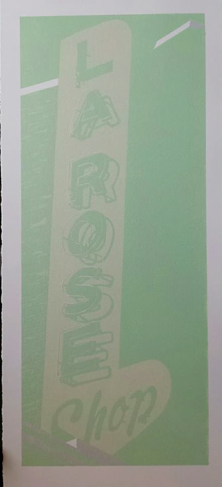
I will be doing some printing this week so I promise to get the next update out as soon as possible.  I may even print tomorrow night....maybe the M or maybe even the Shake Shack.  Carving on the La Rose Shop has also started and should be completed relatively soon.  I'm going to do a little research on how to make a nice brick red color (though I do have some ideas).

Til next time!

#art #printmaking #linocut #lino #reductionlinocuts #linoprint #printingprocesses #shakeshack #YMCA #Pittsburgh #GreenStreet #Greensburg #PA #LasVegas #NV


Tuesday, May 2, 2017

Different type of work day equals some time for art.


So today I'm not working my regular shift and have the morning off.  Since I had some of that time off I decided to finish up some carving on the "B".   I considered printing the next color, but have other projects that I need to advance.  At least I've completed carving away the light yellow of the letter of the actual painted letter.

The image on the left is the completely carved block which is ready for printing while the one of the right is the progress that I had made previously while on break at work.  I do want to double check to make sure that all of the areas are appropriately carved out and that I didn't miss anything.


I also decided to print the shadow on the neon tubing for the 3x3" Shake Shack mini-print.

So far the yellow and light green of the tubing have been printed and I've even carved this block so that it's ready for the color in a couple days.  According to my notes I still have to print a light grey, dark grey and either a black or a very dark grey.....probably a very dark grey.  It always seems to work out better than black.


I've also torn up some paper and started placing registration tabs on them for the Utah desert/bluffs linocut that I've started.  I'll be honest when I say that I really don't know what to call them.  I'll be excited to get that piece started as I don't do many landscapes and it's definitely something I want to learn to do better.

I'm also starting to play with some other images from Zion National Park, but for the moment it's simply just playing with them until I perhaps get them to a point where I'm comfortable with them.

Below are the photoshopped versions of the photos.  I sometimes use photoshop to try and break a photo down into simpler forms as things can sometimes be a bit overwhelming with all the information, colors and variations.  I've been working with the bottom left the most as the way the rock seem layered over one another really appeal to me.


#art #printmaking #linocut #reductionlinocut #ideas #printingprocesses #carving #printing #ink #B #BucaDiBeppo #neon #sign #landscape #Utah #ZionNationalPark #photoshop 


Saturday, April 29, 2017

"B" and La Rose updates!


I really wanted to get to this update as quickly as possible instead of waiting for an entire week to put it up.  Here is the second printing of the neon B.  I made a small carving error and since I had no easy direction to go I decided to move forward and somewhat backwards with my printing.

I'll wait until it's completion to inform you of the error and may actually print a lighter color (white) next in an attempt to fix what I've done.  If you've done this kind of work before it may be simple to figure out the error, but so far so good with what I've done.  The next color may be a make or break stage for this piece.  Registration though is dead on, which is great.


I also printed the La Rose Shop this morning in a light green.  These colors (light grey, light yellow and light green) are not exciting me very much.  They are all very muted and now I'm worried that perhaps I've gone to light on the color pallet.

It is nice to actually get some definition to the print and the color proof that I pulled before printing actually looks very nice in my opinion.  I still need to take a picture of the proof which I will edit into this post later.  I do have some other things that I have to take of today so I hope you all are having a great day!

#art #printmaking #linocut #linoprint #lino #reductionlinocut #neon #B #lightyellow #lightgreen #LAROSESHOP #Greensburg #PA #Buca #Pittsburgh


Friday, April 28, 2017

So many projects...


Here are four of my current projects that are in the process of being worked on.  These do not include the street scene and/or the Utah landscape that I'm working on.

It's been a week since my last printing where I printed the two closest with the yellow (as shown).  The yellow for those prints is the first color for the "B" and the small 3x3 Shake Shack logo.

The La Rose Shop up top is completely carved and ready for printing.  I've also finished carving away the "B" and the small neon tubes of the Shake Shack logo and I've begun the highlights for the neon tubing of the "M" as well.  Though I'll admit to running into a small issue with the "M"...hopefully I can fix it and it won't be a big deal.

Below are some of the pics I've taken after working some of the pieces this past week.

3x3 Shake Shack - neon tubing carving

"B" neon tubing - shadow area carving

I should have some more work finished up shortly, hopefully tomorrow and an update shortly thereafter.

#art #printmaking #linocut #linoprint #lino #reductionlinocut #neon #sign #printingprocess


Sunday, April 16, 2017

La Rose Shop - 2nd color printed


Printed the 2nd color for the La Rose Shop linocut on Thursday.  The second color is a light yellow so the excitement here is pretty muted since the contrast between the grey and yellow is not very noticeable.

The most noticeable area is at the bottom left and top right.  In the middle, very lightly is are the neon tubes as well as some brick work down the left hand side.  As I print the next couple colors, these areas should really start to pop more.


Here is a larger detail shot that shows the bricking and a couple of the letters.


Here are also two shots of the carving process as I'm now removing the light yellow area.  The image on the left shows the carving around the letters.  I use a small V-gouge to trace/carve around the letters and then go back in with a larger U-gouge to remove the large areas around them.  Though I've carved around the shop, I find myself currently working up to the top at the moment.  There is a decent amount of carving between the letters, neon tubes and shadows so for some reason I've become drawn to those areas.

I have a couple other projects I hope to get printed this coming week and they'll probably get printed before I'm even capable of finishing the carving here.  We'll see though....it would be nice to get 3 projects printed and this one carved and printed.

#art #printmaking #linocut #lino #linoprint #reductionlinocut #LaRoseShop #neon #sign #Greensburg #PA #swpa #vintageroadsign #vintageneon


Thursday, April 13, 2017

Printing has commenced!!


I've been a little quiet lately as the Easter holiday has ramped up at work and I've had little time to spend printing and working on new works.  Fear not though!!  I've been taking pieces small enough to work and I've been carving them on breaks.  What I cannot take to work I do work on at home.

I have multiple projects that are currently using similar colors and was looking for a day to print each one.  This past Thursday (now almost a week ago) I got to print two of the four projects that I have started.

The La Rose Shop was the first to be printed and used a majority of the light grey ink that I mixed up.  I knew it would take a lot of it as the print is 9x20".  The light grey is the shadow area of the neon tubing and also doubles as the mortar between the bricks on the sun highlighted side of the building.  I'm expecting that this print will top out somewhere around 8-9 colors.  I should be printing the color very soon...possibly even in the morning tomorrow.


I've also started a series of 3x3" prints which I plan to submit to an exhibition.  I've never worked this small and the carving is already giving me new challenges.  The very first color for this neon "M" lino is the same grey as used on the La Rose Shop above.  The entire block was inked as this color will be used for the background of the sign.  I've been carefully carving away the sections and will print a slightly darker grey for the neon tubing color and then yet another for the shadow on the tubing.  I'm thinking that this print should top out at around 6-7 colors, but I'm honestly leaning more towards the 6.

Anyhow, I promise to try and update sooner than I did this past time.  Talk to you all soon.

#art #printmaking #linocut #reductionlinocut #neon #LaRoseShop #Greensburg #PA #swpa #sign #M #YMCA #Pittsburgh