Saturday, March 26, 2016

Progressing along....


Here is the first 5 color progression for the FU (Fuel and Fuddle) neon sign reduction print.  So far I'm very happy with the progress of this print, the registration has been very solid and I'm glad I did a 3 color neon tube.  It was originally supposed to be 2 colors - color of the actual tube and then a shadow, but then I decided to add a darker shadow as well and I'm happy that I did.

Hopefully this'll be dry enough in a couple days that sometime early next week I can print the next color.

Thursday, March 24, 2016

Busy, Busy, Busy....


Today I got to print the next color on the FU block.  This color represents the lighter section of the outside neon tubes that outline the sign itself.  I think overall it's looking pretty good.  I did make a major mistake while printing and I'm concerned it's going to cause me lots of trouble later on.

I have a support that I put at the end of the block so that the paper has something to rest on rather than hang over the edge.  On top of it are 2 loose pieces of unmounted linoleum.  I wasn't completely paying attention and somehow one of the pieces made it's way on top of the block.  When I ran it through the press it got tight, but I couldn't see any issues (paper was in the way and half way through the press).  I made the massive mistake of continuing to push it through.  My block now has an indention where the unmounted lino sat on top.  Hoping I can find a way to fill it in....it's not a large spot, but big enough to bother me.


I also finally got the red finished on the Heinz block.  The ink stayed wet fairly long and that caused some delay in this piece.  I'm currently waiting for the freshly printed red to dry and then I can continue.  I dig already carve away the Heinz logo so that I'm ready to go when it dries.


I also printed the OT block today as well.  This color is the normal neon tubing color.  I got to try my new registration jig that I created.  I think it's going to take some getting used to.  The block fits nicely into the corner, but something about it just seem different....not sure what yet, but I'm sure I'll discover it when I print the next color.  If the registration is off, then I'll know something is totally wrong...if not...then my worrying is for nothing.


Tuesday, March 22, 2016

Did I forget something?? Modern Cafe & Old Heinz Factory Logo

I was just going back through older posts while looking for an image that I could use as a hyperlink for something I was doing online.  I couldn't find what I was looking for on here and was kinda surprised.  I've posted so much artwork here over the past couple years that apparently when I really got into actively posting I forgot to add the pieces that really made me take off with reduction linocut.
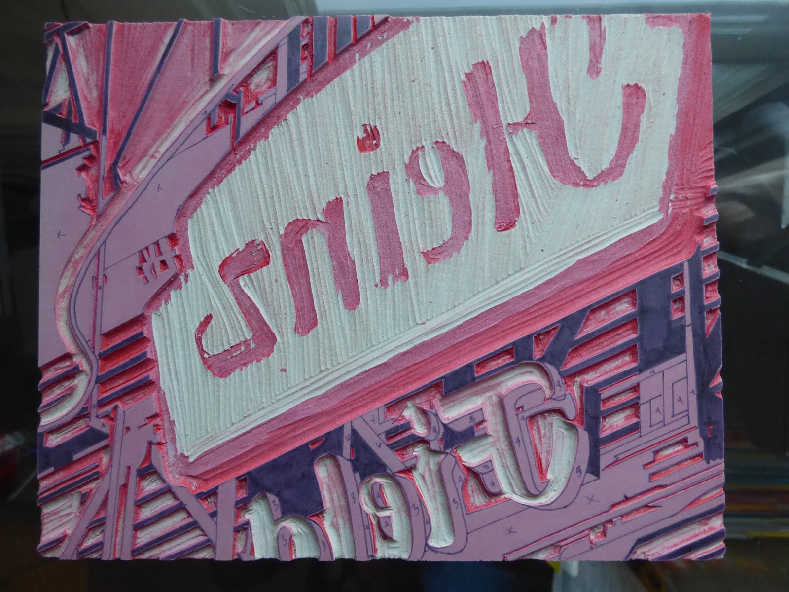
Heinz Company Neon Logo - 8x10 - 3 Color Reduction

This is my first ever reduction print.  I made while taking a class at Pittsburgh Center for the Arts.  Originally these pieces were only supposed to be 2 color, but I just couldn't come up with anything that I wanted to do.  After researching reduction artists and discovering some fantastic and inspiring work I decided that this would be my subject matter.

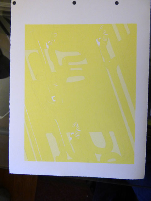
I really fell in love with this process and wanted to create pieces that were considerably larger and more detailed with additional colors.  I purchased an 18x24 piece of mounted linoleum for my next piece and started travelling through Pittsburgh's different neighborhoods looking for the perfect sign.  I found the sign I was looking for on Western Avenue located on the North Side of Pittsburgh.


Modern Cafe - 18x24 - 6 Color Reduction

The Modern Cafe is a small restaurant/bar located at the corner of Western Ave & Galveston Ave.  It was an extremely cold and bright sunny January morning the day I went looking for signs.  I knew the sun was perfect that day, but didn't know what I was going to find.  The way that the sun shown on this sign was perfect.  I probably took about 30+ shots of the sign before the cold really started to get to me...I wasn't wearing gloves and the temps were in the single digits...I said it was cold.

My only disappointment with this piece was that out of 6 prints only 1 is perfectly registered.  I've learned that had less to do with my carving and more with the registration pegs used.  They were rather loose and allowed for a good bit of movement.  The pegs I now use at home are very tight and don't move around at all which explains some of my fantastic registration I've had as of late.
The class that I took was basically a survey course of various styles of printmaking.  I didn't have any experience in any techniques so I figured that if I was ever going to get a job as an art teacher I would need to expand my knowledge.  Below are 2 examples of other printmaking techniques that I learned.


8x10(s) Colograph Plate (right), Colograph Print (center), Drypoint Print (Baltimore)

Thursday, March 17, 2016

Clark Inn Motel - Las Vegas


When my wife and I visited Las Vegas this past September part of the trip was sightseeing and the other half was sort of a research trip for me.  I took a lot of pictures of different neon signs up and down the strip.  We visited the Neon Museum as well and I took almost 200 pics of the various signs and thankfully it was a extremely bright (and blistering hot) day.

The one sign for the Clark Inn Motel caught my eye and it's still one of my favorite photos from that location.  I started a couple days ago cropping and tracing the image for transfer.


I also did a little research on the structure itself today which is no longer at the address listed.  I also managed to find a couple actual photos taken before it's demise and I'm considering creating a block that incorporates my main photo and the information provided by the actual photos.  The above photos show the original sign (probably close to demolition time) and the current state of the sign which is located at the Neon Museum Las Vegas.  I do recommend checking out the Neon Museum as it was filled with hundreds of old signs from old Las Vegas casinos and motels.

#LasVegas #NeonMuseum #neonboneyard #Vegas #Neon #Motel #ClarkInnMotel

Wednesday, March 16, 2016

From the darkest shadows!!!


Printed the darkest shadow on the neon tube this morning.  It is slightly darker than I anticipated, but I'm not unhappy with it either so I decided to just keep with it.  I think it'll really pop once I start getting the other colors added on.

So far the registration has been spot on so I'm pretty proud of myself and each time I print I get more nervous that I'm going to miss.  I still have 5 or 6 colors to go so there is still a lot of time for messing something up.  I've become very careful though about how I'm placing the block before putting the paper down and so far it's done very well.


This is the color proof that I printed first.  I had gotten away from doing proofs I think simply because I was being lazy.  Decided to start doing them again and realized quickly that I should've never stopped with them.  They not only allow me to see exactly how it's going to print first, but it also allows the block to get ink all over it allowing for much better prints from that point on.  If you look closely at this one you can see where the ink didn't sit well.

Have to rip some paper today to prepare for my next 2 prints that I've got started in the pipeline.

Sunday, March 13, 2016

The waiting game Pt1.


So while I'm patiently waiting for the weather to warm up a little I carved away the "Field" and the upper logo part (upper left-ish of block).  I tapped on the red the other day and it's still quite tacky.  I need to reprint the area that surrounds the "Heinz" type, but I guess I'll have to wait some more.

Once it warms up and it's going to in the next couple days, I'll get around to printing the next color for the "FU - Fuel and Fuddle" neon lino I'm also working on.  Just concerned that the paper has altered slightly due to the humidity.  I'll be honest, I'm not sure how one knows that the paper has changed, but I've heard multiple printmakers talk about it.  Since the registration on the FU has been so precise I don't want to chance it so I will wait out the weather.  Should have something printed and posted by Tuesday or Wednesday.

Also starting a new print so that I can keep busy and need to tear some paper for another lino block that is ready to go.

Thursday, March 10, 2016

Little Red


Printed the red for my Heinz sign this morning.  Pretty happy with it, but registration has altered on a couple.  I'm wondering if the change in weather has caused the paper to change in the slightest way.  Might need to wait for it to warm up until I can print the next color.  Should only be a dark grey and a really dark grey to go before it's done. 

Here's my new red.  Daniel Smith unfortunately has discontinued it's entire line of relief inks, but thankfully they still had red left at their online store.  It's the kind of red I've wanted as it is closer to the red that everyone loves and knows.  Napthol is a little too warm and Quinicradone (sp?) is too cool for this project so I'm glad I went and spent the money to get some of this ink.

Monday, March 7, 2016

Hello to new colors!!!


I'm feeling very accomplished and proud of myself today.  I mixed the 3rd color for the neon tubing and printed it this morning.  I wasn't sure about the color at first, but didn't want to go to dark so I printed what I thought was going to be good and I'm so thrilled that I stopped.

Above are the actual print with the 3rd color applied, the proof of the color (bottom left) and the block before printing (bottom right).


These are the color swatches I was making while mixing the ink.  I started with the yellow that was used for the 2nd color and started adding in small increments of purple/violet .  For those who don't know, if you want to dull out a color you merely need to add it's complimentary color from the color wheel.


Here are some pics of the process.  The left picture is the plate that is all inked up.  I recently bought that brayer in the background and I'm constantly wondering why I didn't pay the $40 sooner.  Probably the best $40 I've ever spent.  

The picture on the right is of my plate placed onto the printing bed and placed into the registration jig and ready for the registration pins to put in and the paper placed.


Friday, March 4, 2016

Busy Day!


Fuel and Fuddle - FU block, neon color print and value scale

Got to print the 2nd color for the FU print today.  Had to create a value scale and add a lot of yellow to make the difference in light-ish yellow noticeable.  I'm getting ready to shortly start carving the neon tubing so that I can print the first of the shadows for the tubing.

Also....


Printed 3 different reds over my 2 greys and black stripes.  I used a Speedball oil-based Red and Gamblins Napthol and Quinacridone Reds.  So far the Speedball gave more of the results that I was looking for.  Considering getting the Daniel Smith red before they are all gone.  If I don't then I'll probably have to print a layer of white before proceeding to print the red.  The Heinz logo is bright red and in no case did I get that color, so I guess I'll have to try and figure this out.

Have a show I want to submit the Heinz Field logo into so I can't wait too long to figure out a fix for it.